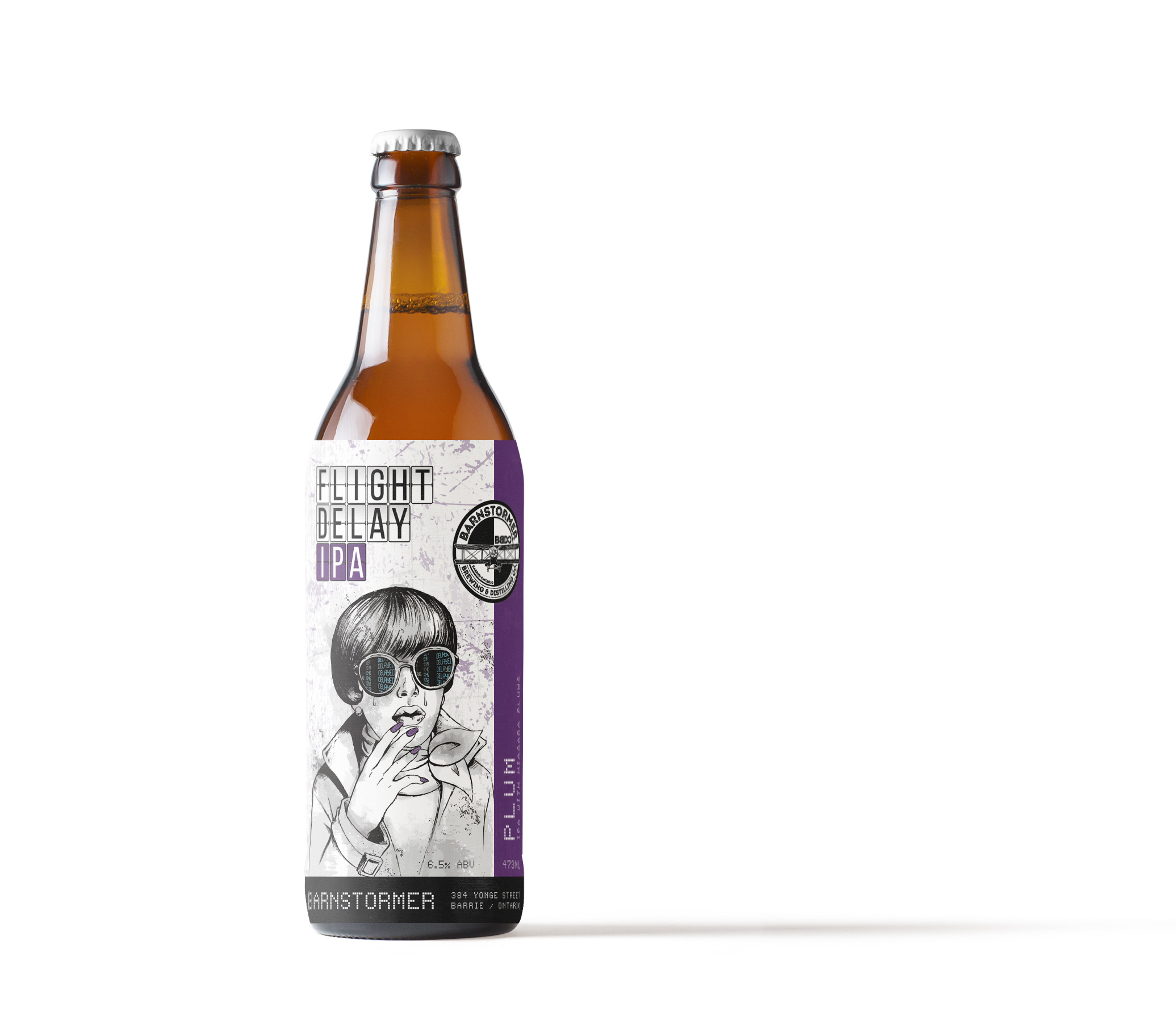
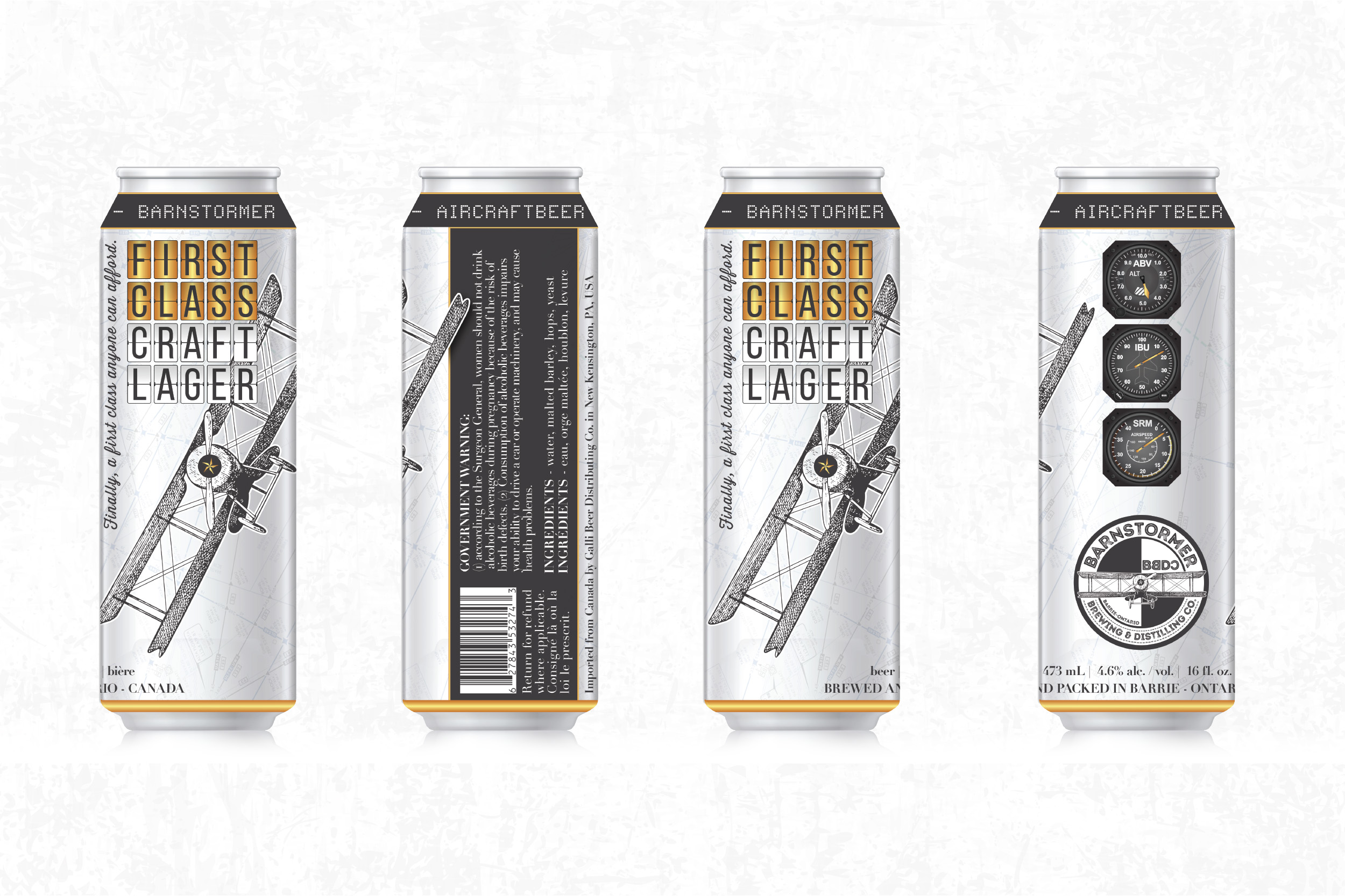
The original brand behind Barnstormer Brewing Company lacked finesse. It was cartoonish and out of style in an increasingly competitive industry. We were approached to modernize the brand, including its logo, brand language and product packaging.
The aviation theme of the business allowed for a lot of creative freedom in the direction. We ultimately decided to bring the brand from the economy section into first class. The custom illustration adorning the new logo captures the original airplanes that inspired the brand. We created a custom typeface for its core beer packaging that could be used as a standard for all subsequent product packaging. We placed actual flight maps of the region in the background of the labels and modeled the ABV, IBU and SRM indicators after actual airplane instrumentation to keep the aviation theme at the forefront and used metallic gold trim to add a sense of refinement that the company wanted to portray.
Welcome aboard the newly designed Barnstormer Brewing and Distilling Company.